I went to see the Poster exhibit, Hiroshima Appeals, at the Japan Foundation in Toronto, in commemoration of the 80th anniversary of the end of WWII and the atomic bombing of Hiroshima and Nagasaki.
Hiroshima Appeals has been operating since 1983 as a poster campaign project, with the key goal of promoting peace, through the collaborative efforts of Japanese graphic designers. This exhibit was a two-way win for me; my interest in peace in relation to graphic design and I take inspiration from many Japanese graphic designers; Fukuda Shigeo and Kenya Hara being top of the list, and Japanese graphic design overall.
This exhibit was a kind of a visual time capsule not just of the past, but of how each generation has tried to make sense of Hiroshima, nuclear war, and the hope for peace. Some posters were pretty poetic, some more hard hitting and deeply sad. But nearly all of them made me stop, look and look again.
———-
Here are a few that stood out for me:
1985 – The Earth by Fukuda Shigeo
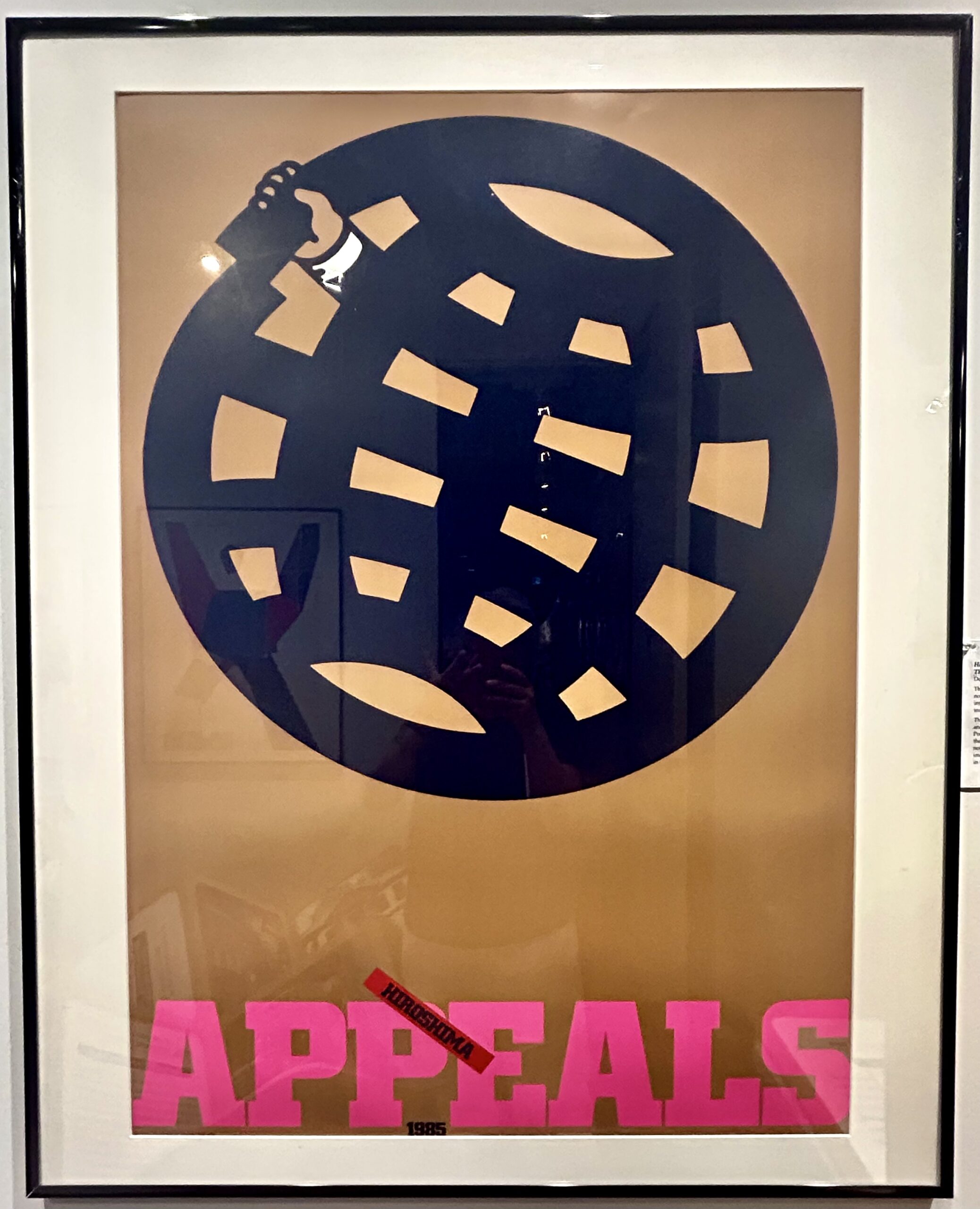
Fukuda is truly one of my favourite and this exhibit was treat as it had a pretty large body of work from him.
Fukuda’s poster, that I really enjoyed, doesn’t try to make ‘peace’ look pretty. Instead, he leans into how hard it is to capture something so big in a single image. He talks about the ‘fundamental issue of human happiness,’ and ties peace not just to war, but to things like food security and the environment [my way of looking at peace too]. His approach is to focus on what we shouldn’t do. A reminder that sometimes peace begins with holding back, with restraint, with choosing not to cause harm.
1988 – A Single White Dove by Tanaka Ikkō
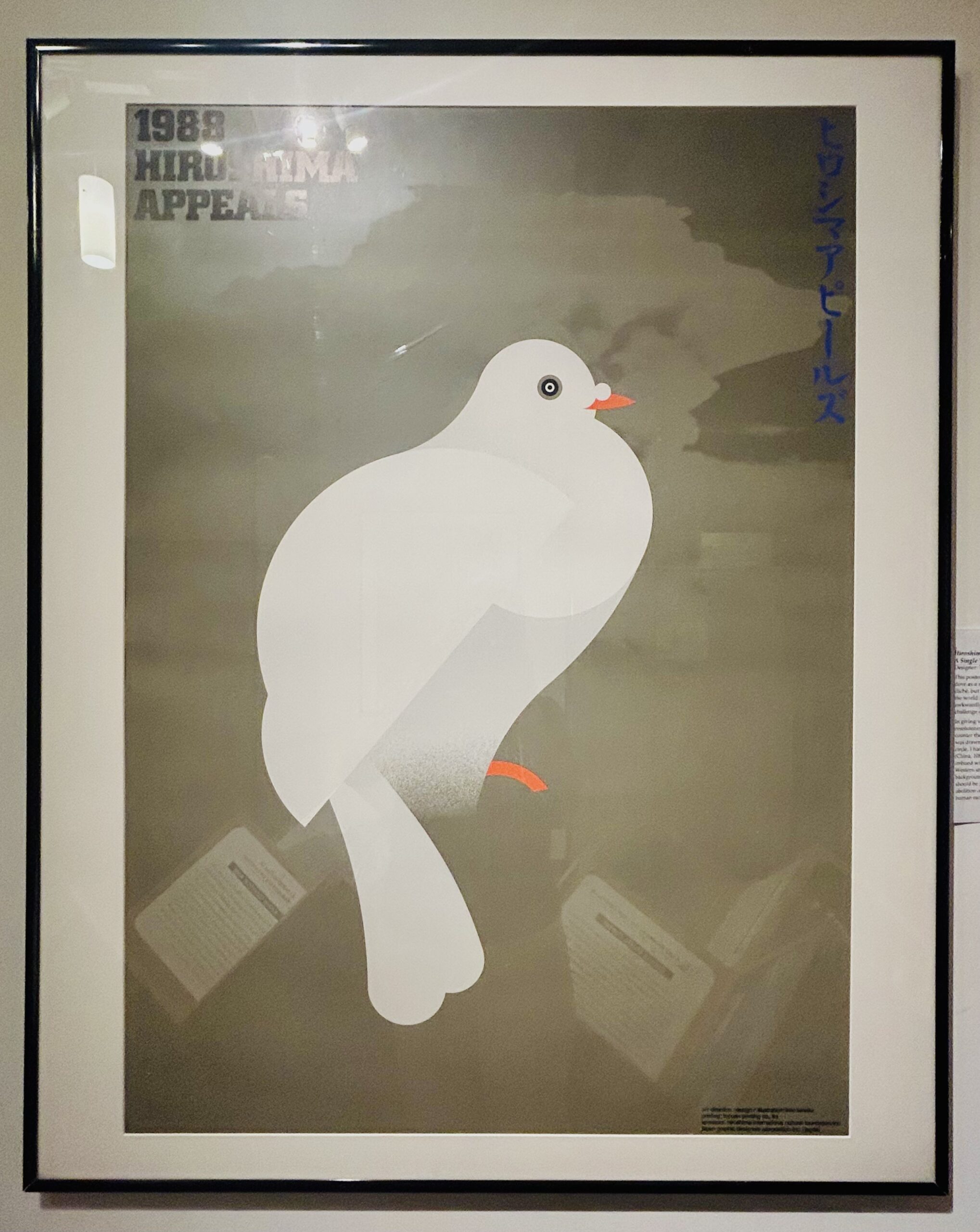
We’ve all seen the white dove used as a symbol of peace. It’s everywhere, but he gave it a new meaning. Instead of going for something clever or trendy, he created a strong, clear image, an image popularly understood, a white dove drawn with geometric precision, set against the shadow of a mushroom cloud. It’s both delicate and devastating. He reminds us that even familiar symbols can continue to speak volumes, if we let them.
1955 – The Weight of Hiroshima by Satoh Taku
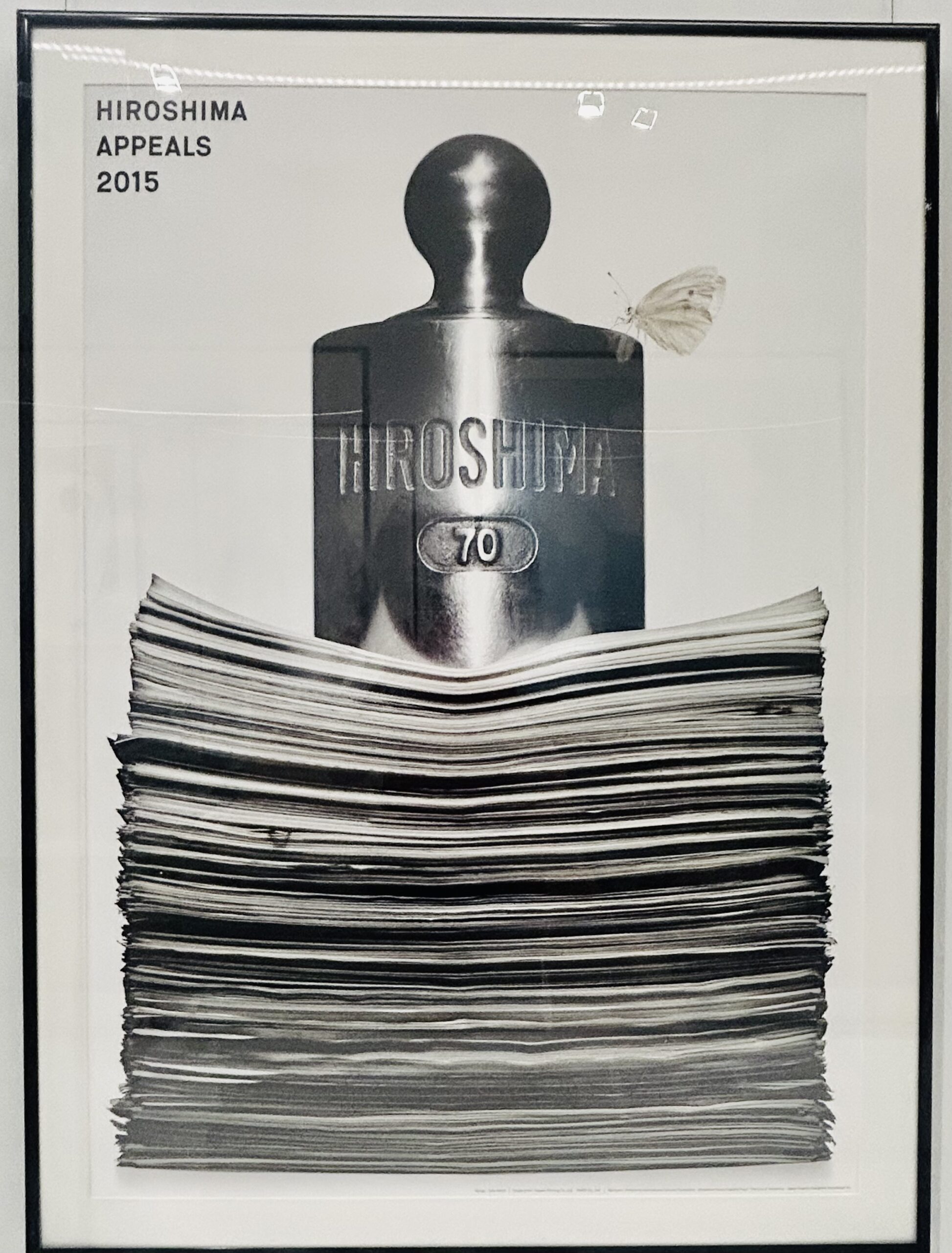
This one really got to me. A heavy metal weight sits on a pile of documents, each one representing an argument made to justify the dropping of the bomb. The message is painfully simple: no amount of bureaucracy and paperwork can make it right. And then there’s a butterfly perched on the weight, a callback to a Yusaku’s earlier poster in the series using the butterfly as a small delicate symbol of life, barely holding on under all that weight.
1958 – Mushroom Illustration by Kenya Hara
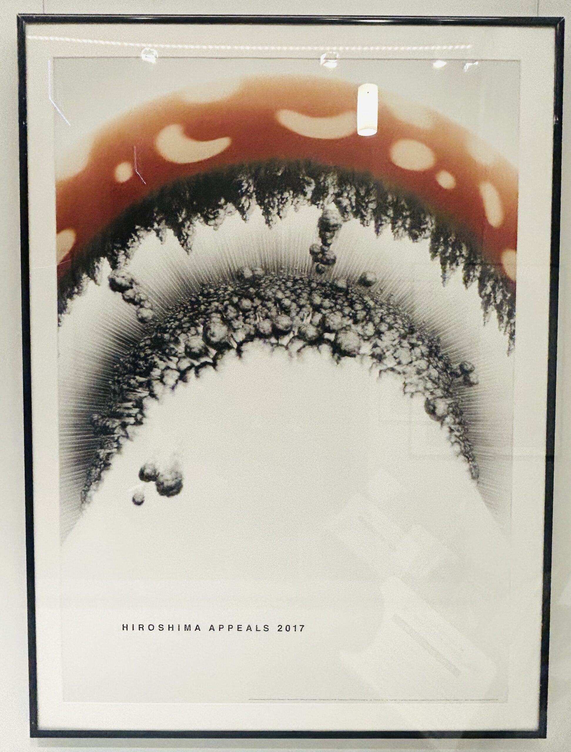
’The human race is not as wise as we think. It is depressingly stupid that mankind can destroy the foundations of civilisation, to prioritise self, country and creed. Our existence may be far more short-lived than other creatures that live in respect of nature’s bonds.’
With his illustration, Hara’s idea is to look straight into the explosion, literally, showing the view from below the mushroom cloud, as if we’re standing right under it. He writes that ‘the human race is not as wise as we think,’ and when you look at the image, it’s hard to argue. It’s raw, emotional, and filled with anger and sorrow. He says he wanted to create something that could lead to prayer. I think he did.
1958 – HIROSHIMA by Ōnuki Takuya
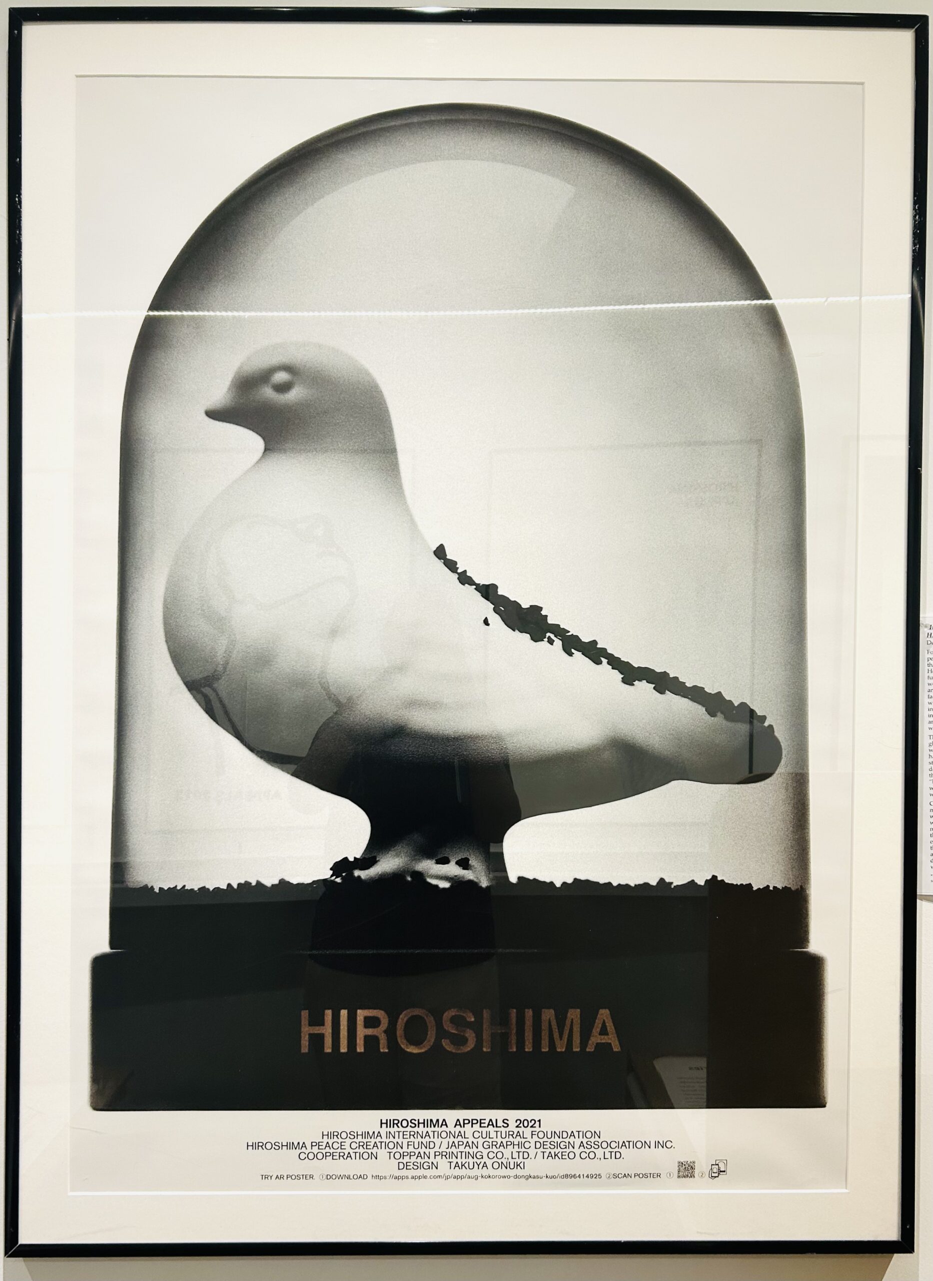
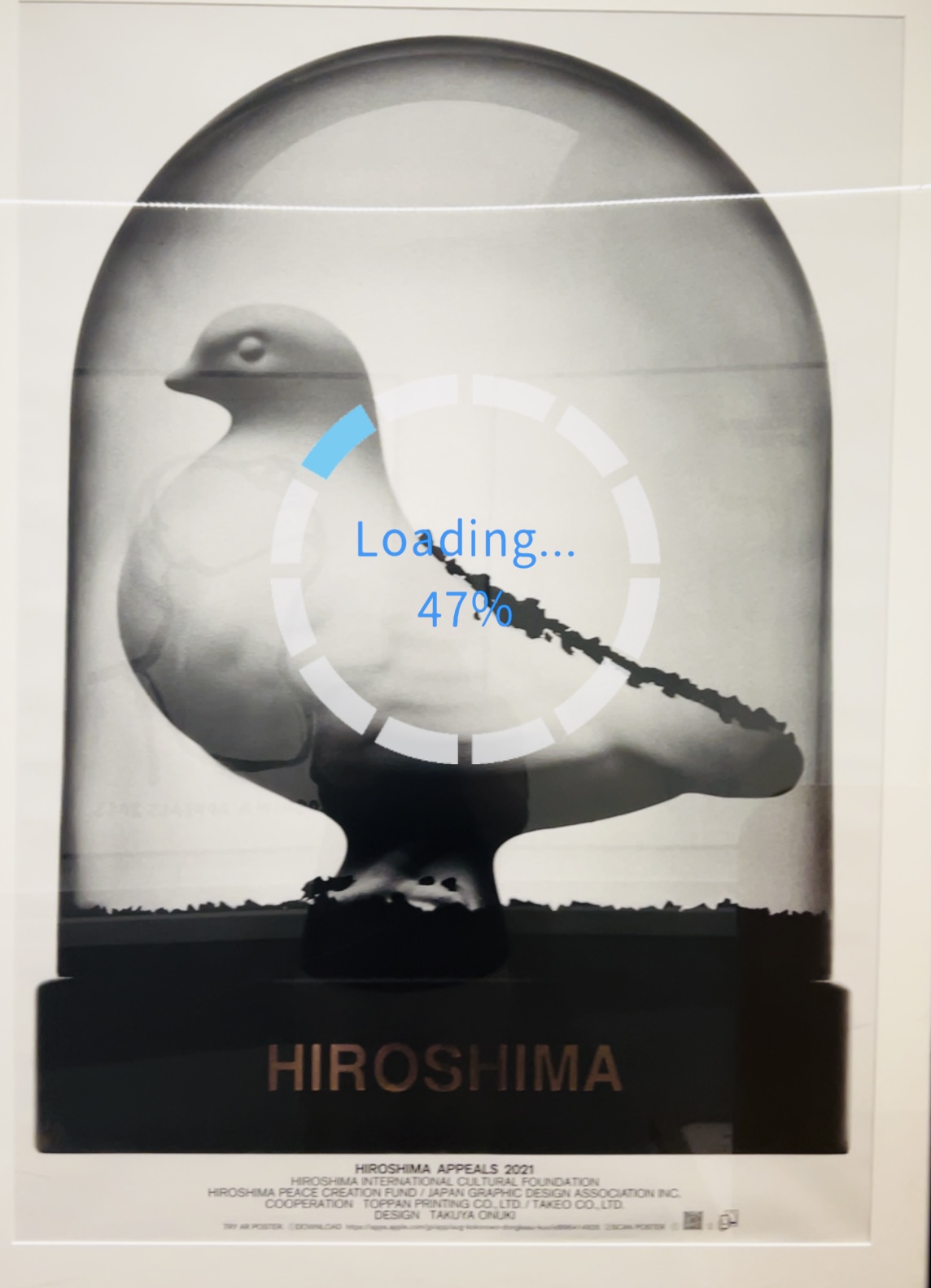
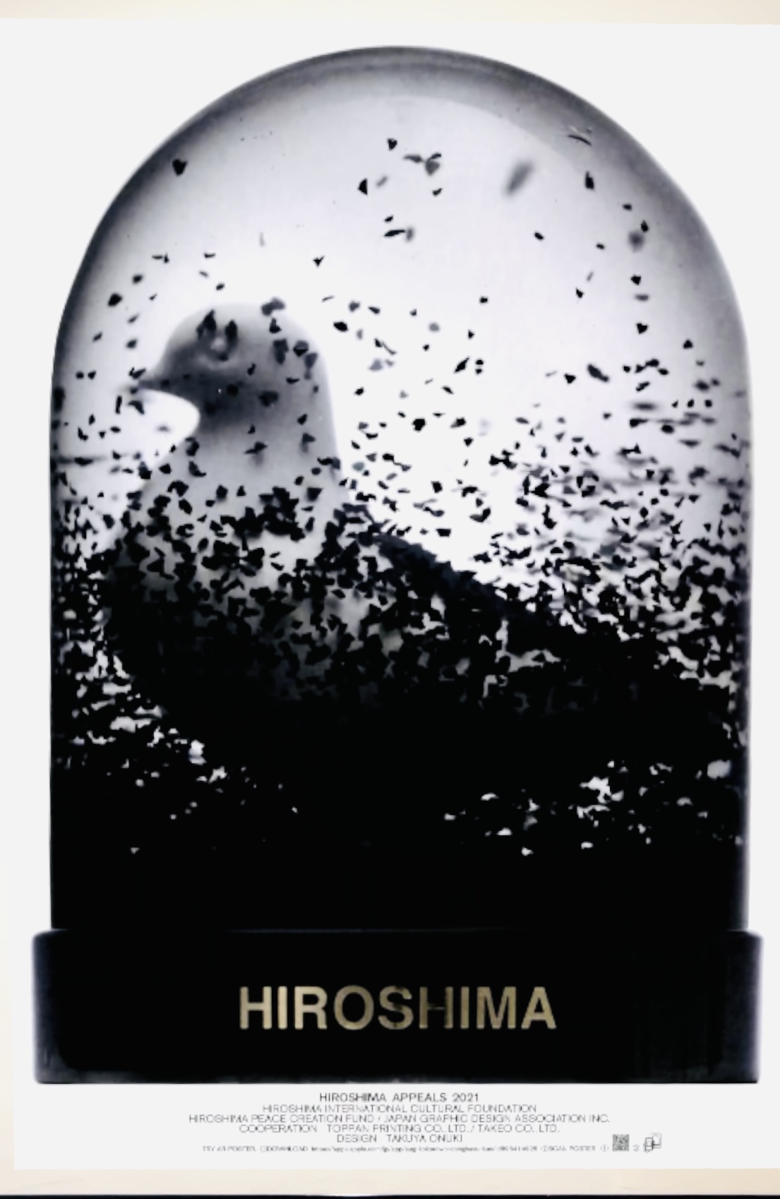
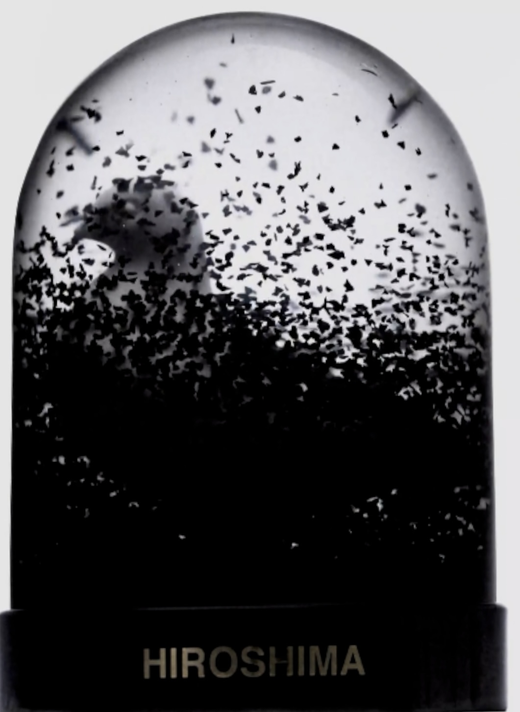
This poster uses AR (augmented reality), and the use of technology here is so apt and well used, with a pretty cool and unexpected twist. You can hold your phone over it and watch black powder slowly fall inside a snow globe, burying a white dove trapped in the glass. [I took screen shots on my phone to try show this unsettling effect]. Ōnuki made this for the younger generation, those who didn’t grow up hearing stories about Hiroshima firsthand. It’s a reminder that memory needs tending, or it fades. For Takuya the dove hasn’t flown free yet, but maybe one day it will.
1945 – Victory by Fukuda Shigeo
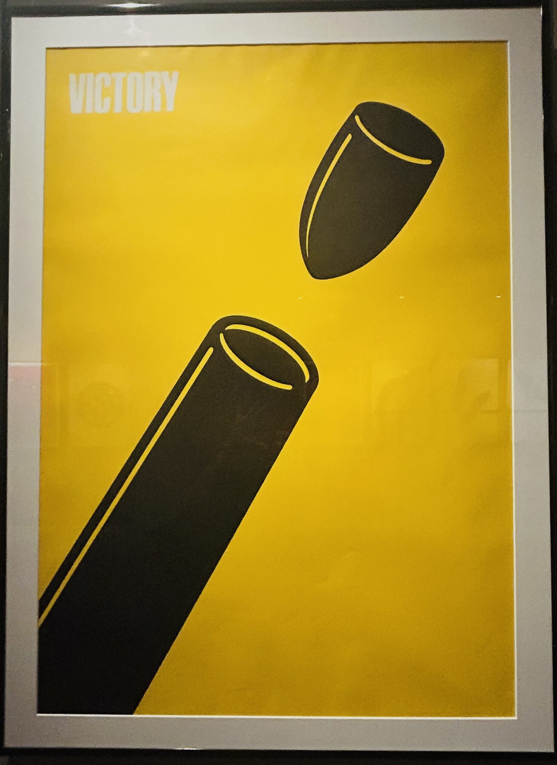
This one wasn’t directly a part of the Hiroshima Appeals series, but it was on display, and honestly, I couldn’t not include it. Fukuda’s Victory 1945 poster is bold, minimal, and hits hard without saying much. A cannon. A cannonball. And instead of being fired outward, the cannonball is flying back into the barrel.
At first glance, it almost looks playful, clean lines, bright yellow background, a clever visual. But then it sinks in. Fukuda is known for his brilliance in using figure ground relationships. The cannon is basically shooting itself. This is Fukuda’s take on ‘victory’ in war; destructive, ironic, and ultimately self-defeating.
2008 – Citizen’s Peace Stamp Poster by Aoba Masuteru
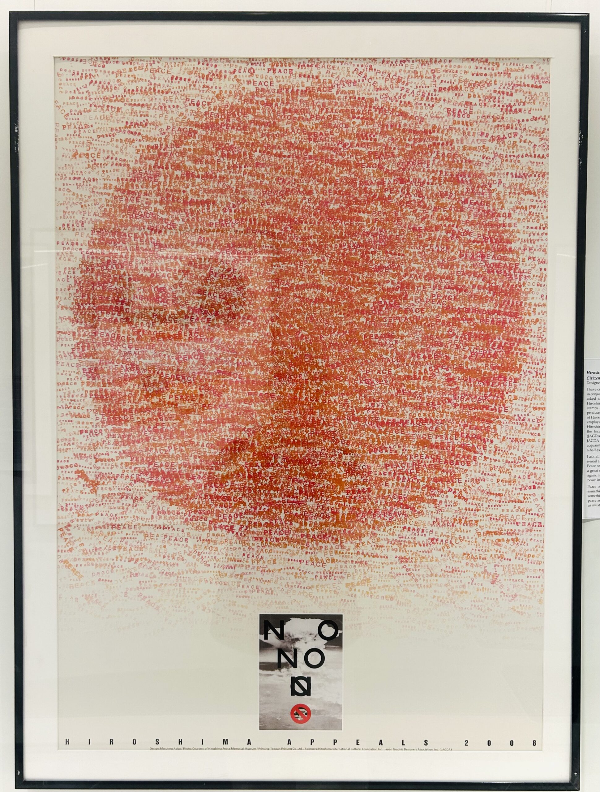
This poster is all about collective voice. Designer Aoba Masuteru invited everyday people, from children to local officials, to press stamps with the word ‘Peace,’ creating a red sun made up of thousands of individual impressions. From a distance, it looks abstract. Step closer, and you realise it’s made entirely of the word ‘Peace,’ written again and again by different hands. The message is simple but moving, peace isn’t handed down from leaders or declared with a treaty, it’s built through small, repeated acts by all of us. Aoba calls peace something we carry in our hearts, not something that can be won or defended.
———-
Overall, one thing that really stood out to me during the exhibit, and that I’ve felt before when looking at Japanese graphic design, is just how different their approach is from many Western designers. Japanese designers have long worked at the intersection of tradition and modernity, blending calligraphic sensitivity, minimalism, and symbolism with deeply conceptual thinking. There’s often a sense of restraint, poetry, and quiet power in their work. Unlike the louder, more commercial styles often seen in the West, Japanese design feels kind of meditative. The way I see it its always been more about evoking a feeling than delivering a straight on message . Designers like Ikko Tanaka, Shigeo Fukuda, Kenya Hara, and many others have shown how graphic design can carry moral weight, cultural importance, hand in hand with aesthetic elegance, all at once. Their work generally does not directly communicate or give straight answers, it ruminates and makes you feel and think.
This exhibit for me was a reminder that peace isn’t just an idea, it’s a process, a struggle, a refusal of sorts.
It also reaffirmed my Design for Peace initiative to further explore how design can help us engage with complex, often uncomfortable questions around conflict, history, and coexistence. These posters are a perfect example of how design isn’t just decoration, it is dialogue, it is soft resistance; It is a way to hope, and to imagine a different future.
If you’re in Toronto, the exhibit’s running at the Japan Foundation. I’d really recommend seeing it in person. It’s a small quiet space, but it stays with you. You should ideally book a slot online, and the admission is free.