‘&’ Design Collective
The Design Collective where design meets uniqueness; showcasing a selection of independent brands ranging from art to stationery and everything in between.
A concept store and a multidisciplinary lifestyle brand, ‘&’ DESIGN COLLECTIVE is where designers will come to showcase their distinctive and exclusive products, sourced locally or internationally, to sell and give their brand the required exposure, in this vibrant and multi-faceted city of Toronto. ‘&’ DESIGN COLLECTIVE will have a space in the dynamic and happening area, in uptown Toronto, owing to its high energy and an interesting mix of consumer segment. The store will hold openings; have design talks, book readings etc. to make this space a hub for designers and the consumers, giving it a definite edge and taking it beyond just another market or shop.
Consequently, ‘&’ COLLECTIVE will aim to bring out high quality design publications under its banner and will also take in commissioned work in the all-encompassing fields of design and photography.
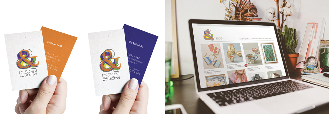
It will market itself and its associated vendors via various social media platforms, including, but not exclusive to a website, Facebook page and Instagram.
The ampersand is a visual representation of the phrase “and, per se and.” It is a graphic representation of the Latin “et,” which translates to “and.” That definition is how the ampersand is most commonly used today — as an inclusionary symbol meaning ‘and’. The character dates to 45 A.D., according to a history of the letter by type designer Max Caflish for Adobe.
‘One of the things that really draws me to the character is the intrigue behind it. The ampersand is one of the few characters in the English language that stands alone with a distinct meaning. Think about it, other characters have to be combined to mean something specific. The ampersand does it all.’ [designshack.net]
The idea for this identity was to use the ampersand in varied fonts and colours symbolizing the coming together of different people and ideas with a range of products and ventures, each having a distinctive and unique voice, but all coming together in sync.
The ampersands would work in combination as the key logo, but could can be use individually to represent diverse areas of the business.
https://issuu.com/sheerazwania/docs/_brand_book_pdf-2


Leave a Reply
You must be logged in to post a comment.