Sunshine Villa Montessori, has been in the business of training young minds since the last 5+ decades. They follow the popular and effective Montessori method of education, developed by Maria Montessori over a 100-years back. According to the Montessori programme, toy building blocks are an important component for a child’s all-round development. They not only help develop gross and fine motor skills, but also improve cognition.
Sunshine Villa Montessori was looking for a refresh in regards to their brand. They wanted to present a modern and up-to-date look and feel for their brand, which had lately started to be conceived as dated.
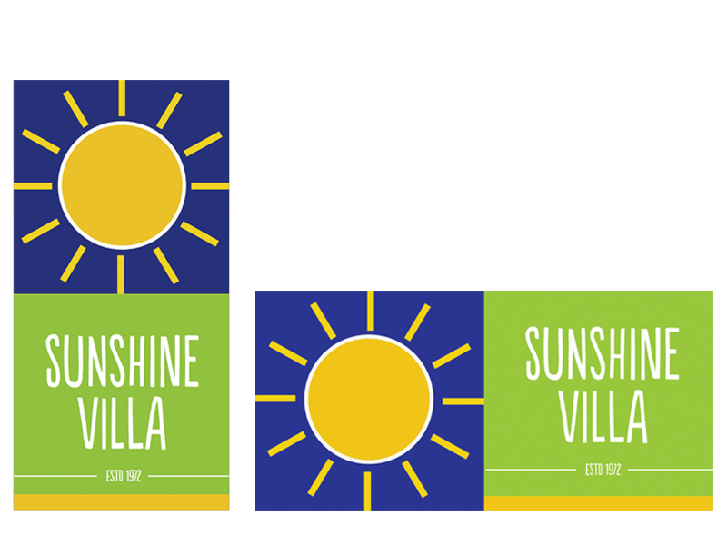
With this rebrand, the aim was to not only give them a renewed and fresh identity that brought them back into the current times, but also give them a design that was flexible and adaptable for their various and recurring requirements. The key concept of using the square shape as a base form was based on some of the key words the shape symbolizes;
- Basics
- Balance
- Grounding
- Structure
- Foundation
- Elemental, and
- Stabilizing
Also, the square here depicts the building block that can be stacked in various ways to build on and lends to the adaptability of the design. On a conceptual front, the building blocks signify an immense contribution to the development of a child as does this old and established institution.
Green and yellow, were derived from the clients’ old logo for purposes of continuity. Yellow a basic primary colour, portrays sunshine, positivity and brightness. Green signifies growth, harmony, freshness.
Leave a Reply
You must be logged in to post a comment.