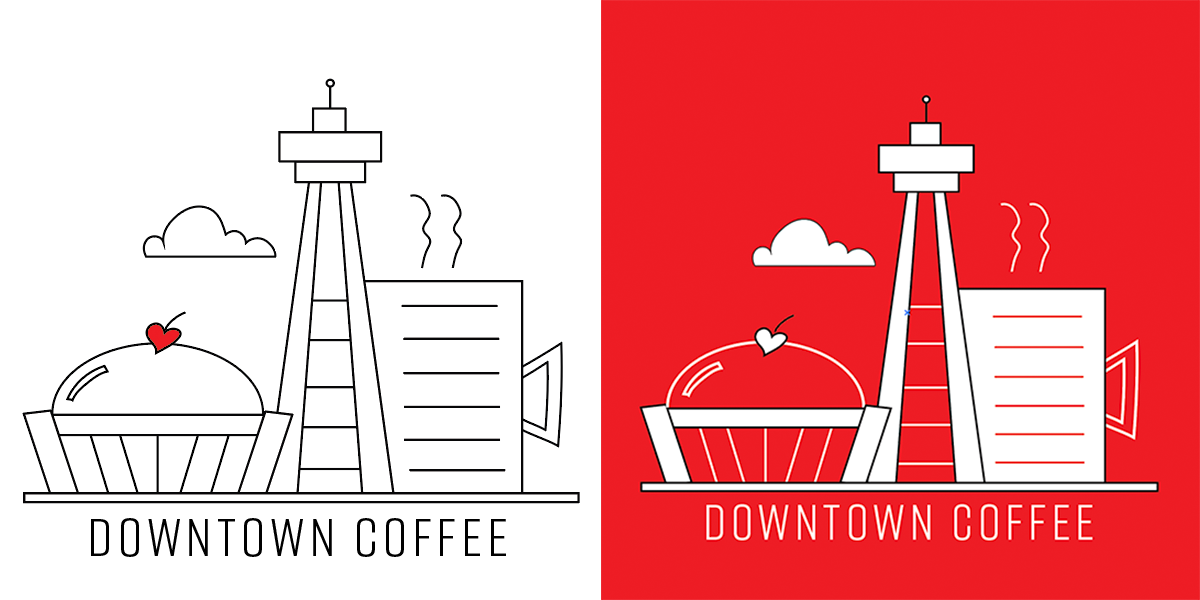
Client: Downtown Coffee
Downtown Coffee plans to be a casual and fun coffee joint in the heart of Toronto, on the Lakeshore.
The client wanted an identity that imbues the energy of the city. The final logo design is minimal but quirky, fun and breezy. It looks sharp on the desired collateral like coffee cups and shop signs. The colour red is a natural choice for the logo due to its association with the colour of the national flag and identity.
The logo has the ability to extend itself in the future, encompassing the various iconic aspects of the city in its branding.


Leave a Reply
You must be logged in to post a comment.