I usually borrow books from my local library, but every now and then, one resonates so deeply that I feel compelled to add it to my personal collection. This was one of those books. Thank you to my friend Trudy, for recommending this book. The designer in me of course loved the graphic novel version of this book.
For me, this book wasn’t so much a history lesson as it was a lens, sharp, unsettling, and urgently focused on the present. In today’s climate of distortion and division, I’ve been contemplating over a persistent question: what does resistance mean today, and how do we incorporate it in the small, deliberate acts of daily life?
As someone who thinks a lot about peace, not necessarily as an outcome, but more as a process, I found myself reading Snyder’s words through the filter of my own thoughts and work. The book echoed many of the questions I explore in my Design for Peace project: How do we hold space for truth when the truth is under siege? What can visual culture do in the face of authoritarian drift? And how might design help us imagine, and in turn build, more just and humane futures?
This post isn’t a book review. It’s a reflection on what On Tyranny stirred in me – and how its lessons impact the way I think about resistance, responsibility, and the quiet power of thoughtful design.
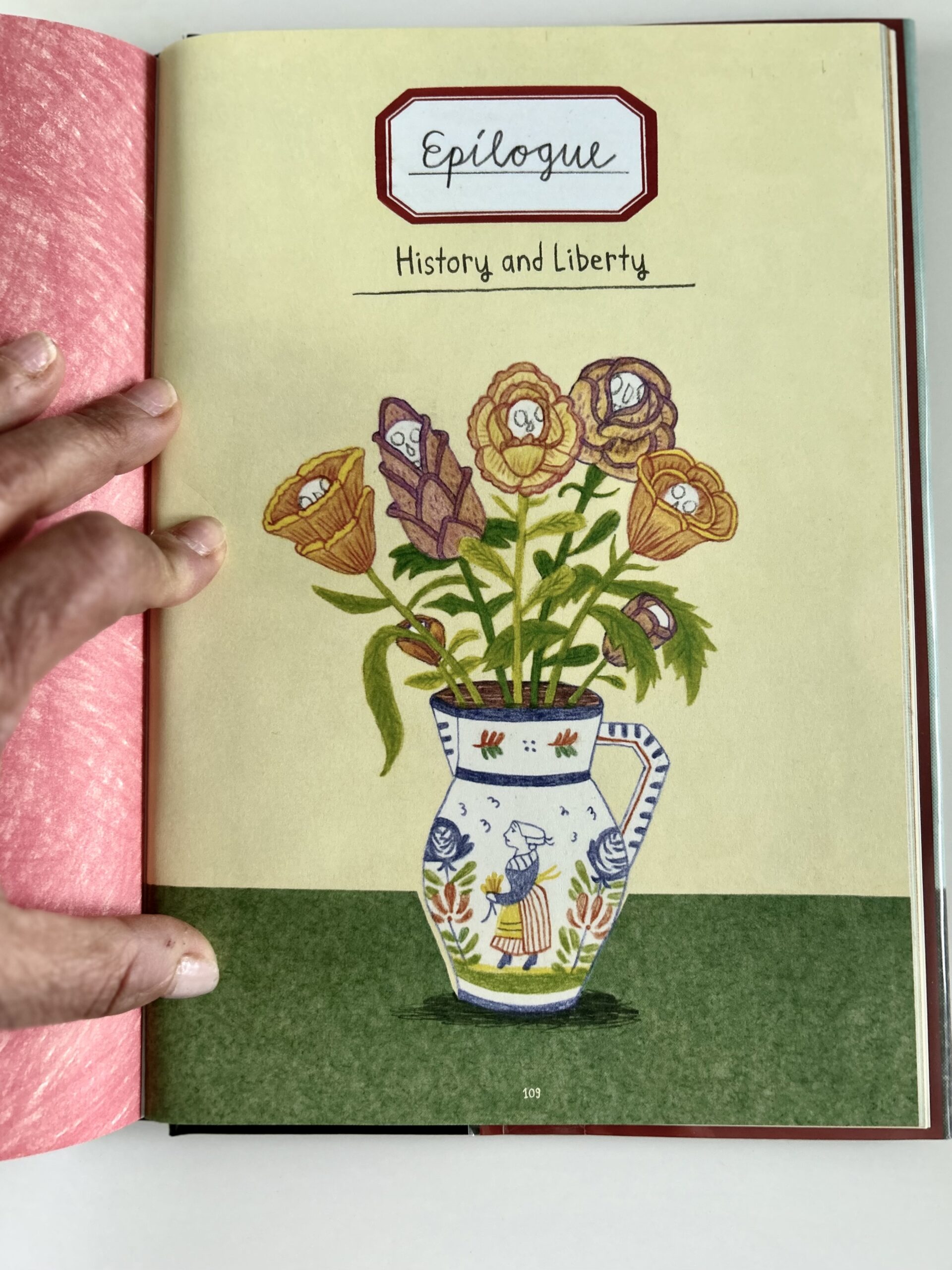
Timothy Snyder’s book offers 20 short lessons – each one a provocation. Some are sweeping, like ‘Defend institutions’, while others surprisingly intimate, like ‘Make eye contact and small talk’. But a few stayed with me in ways that directly intersect with how I think about my work – as a designer, as an educator, and as a citizen in a world growing more fractured by the day.
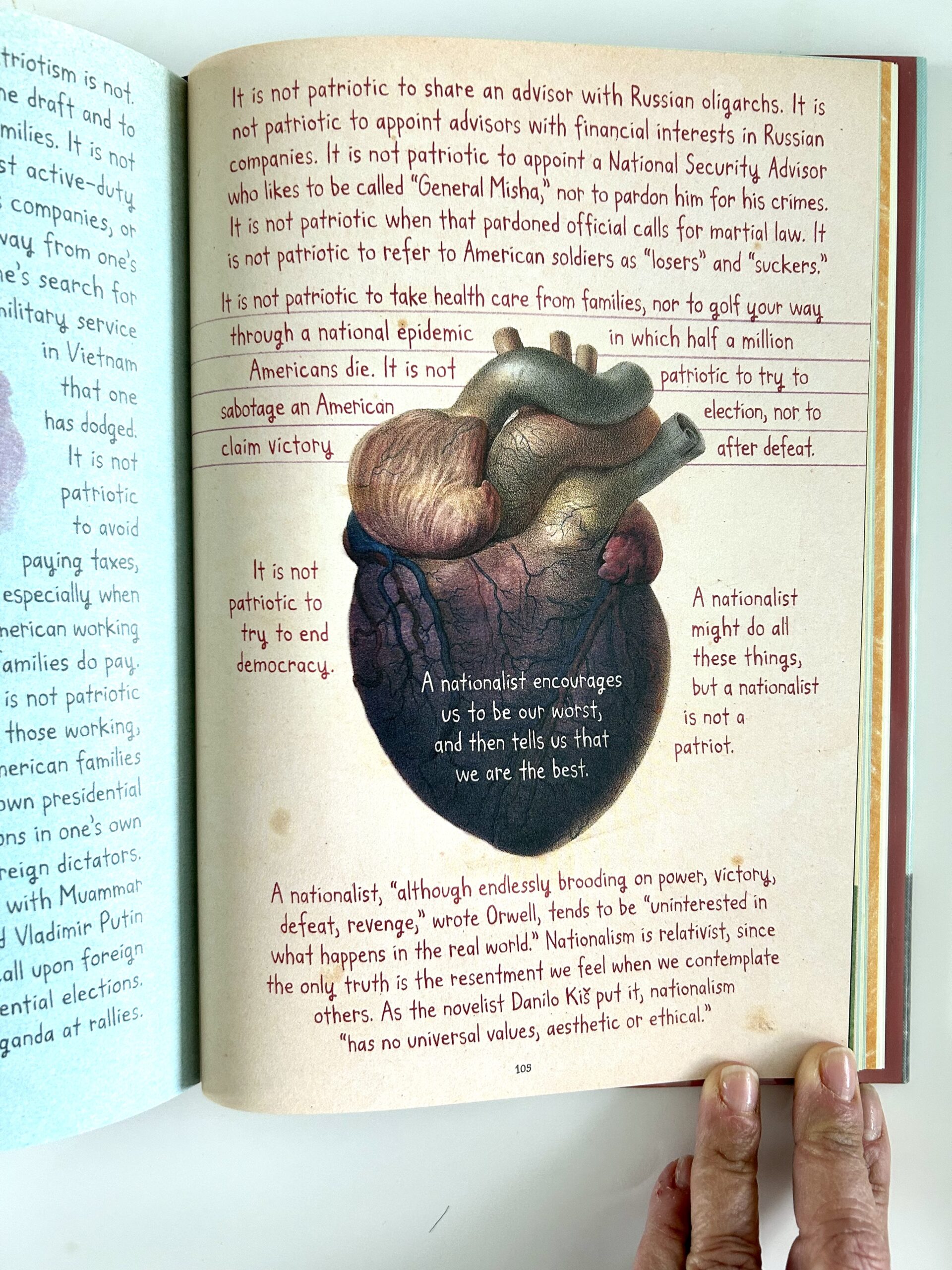
‘Believe in truth.’
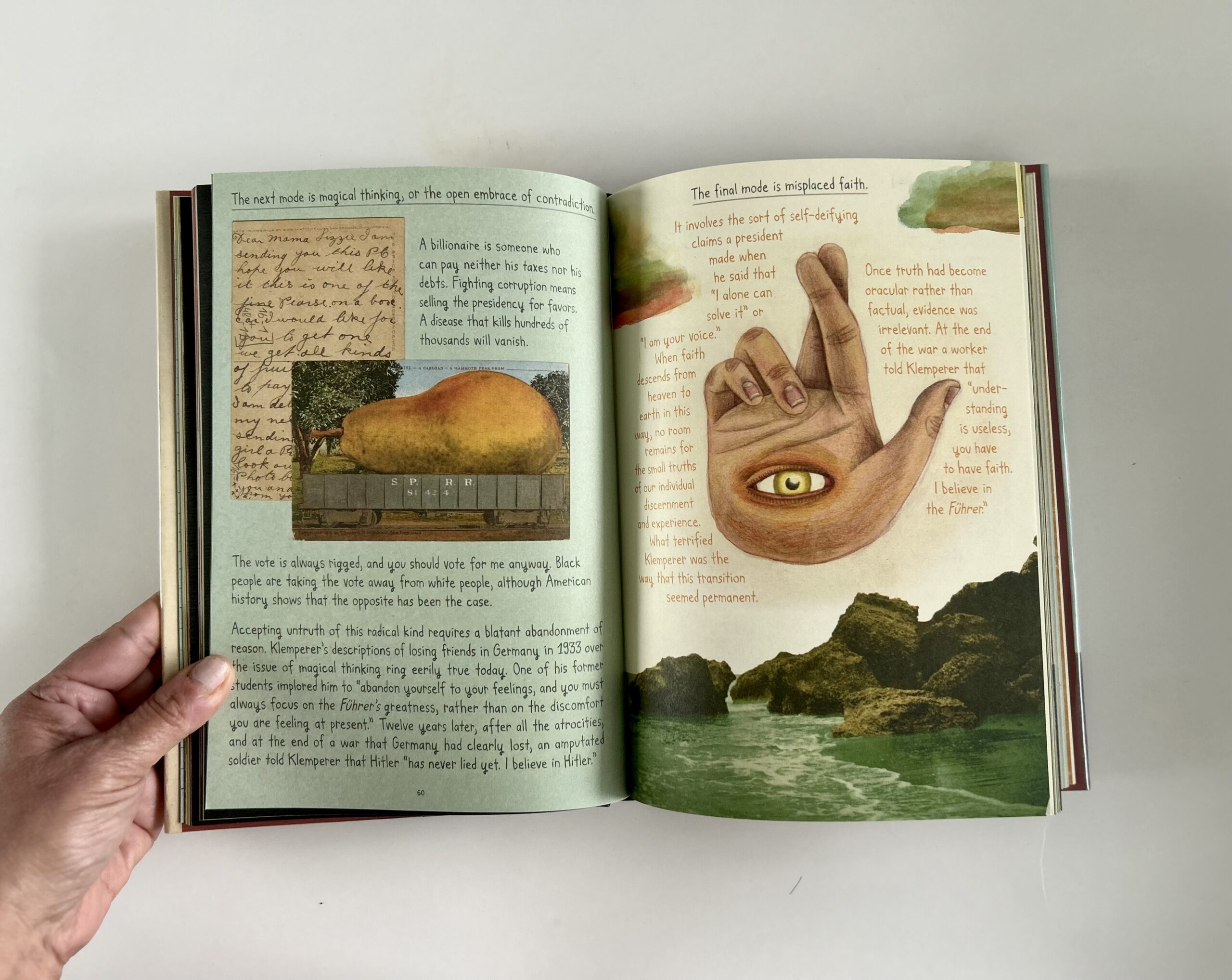
Snyder’s call to ‘believe in truth’ may on the outside seem self-evident, but in today’s media landscape – shaped by algorithmic silos, misinformation, and image saturation – truth often becomes contested terrain. As a designer, I’ve come to understand that we don’t just communicate ideas, we shape what feels real. Fonts, colours, layouts, and images are never neutral. They can amplify truth, or distort it.
In the Design for Peace course, one of the questions I ask is: how do we design in a way that resists propaganda, simplification, or manipulation? Believing in truth isn’t passive – it requires attention, questioning, and, sometimes, quiet refusal.
‘Be wary of paramilitaries.’
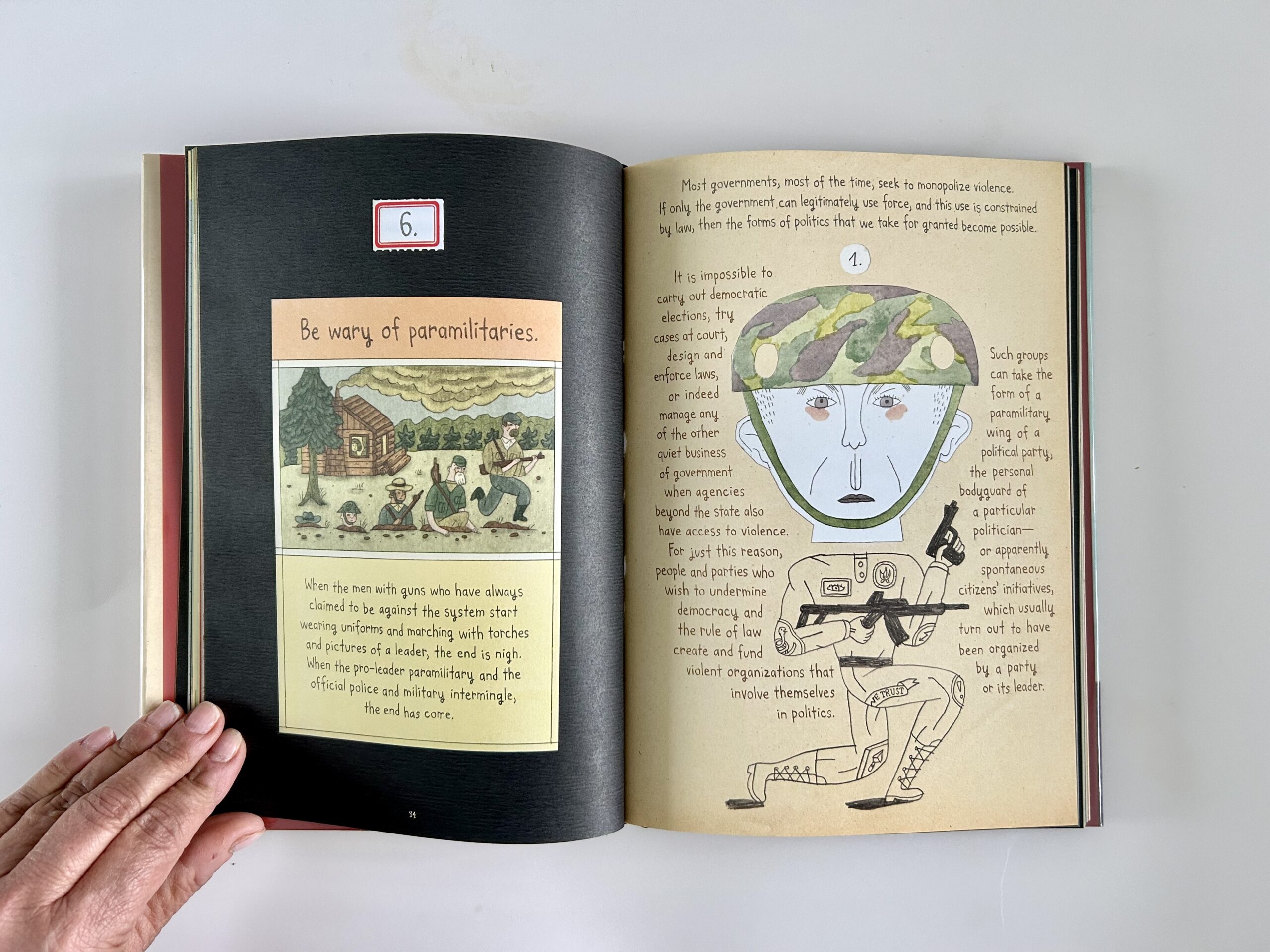
This lesson, at first glance, feels grounded in contexts of overt militarisation. But its warning is more subtle – and more visual – than it first appears. Snyder is alerting us to the creeping normalisation of force: the rituals, spectacles, and iconography that validate violence under the guise of order and patriotism.
It made me think about symbols. About how power often communicates through them: flags, uniforms, insignia, staged photo ops. These images tell us who is in control – and who is not.
In my own work, I’ve wrestled with these questions. When working on peace-related projects, I’ve deliberately chosen the peace lily over the poppy – a small but intentional shift. The poppy, while symbolic of remembrance, is often tied to militarised sacrifice and state-sanctioned narratives of heroism. The peace lily, by contrast, suggests something quieter: restoration, mourning, growth. It resists the sensationalism.
Design can intensify the visual language of control or gently redirect us toward alternative values. In peace-building, that redirection matters. Choosing softness is not weakness. It is resistance – resistance to the glorification of violence, and a refusal to normalise force as virtue.
‘Be kind to our language.’
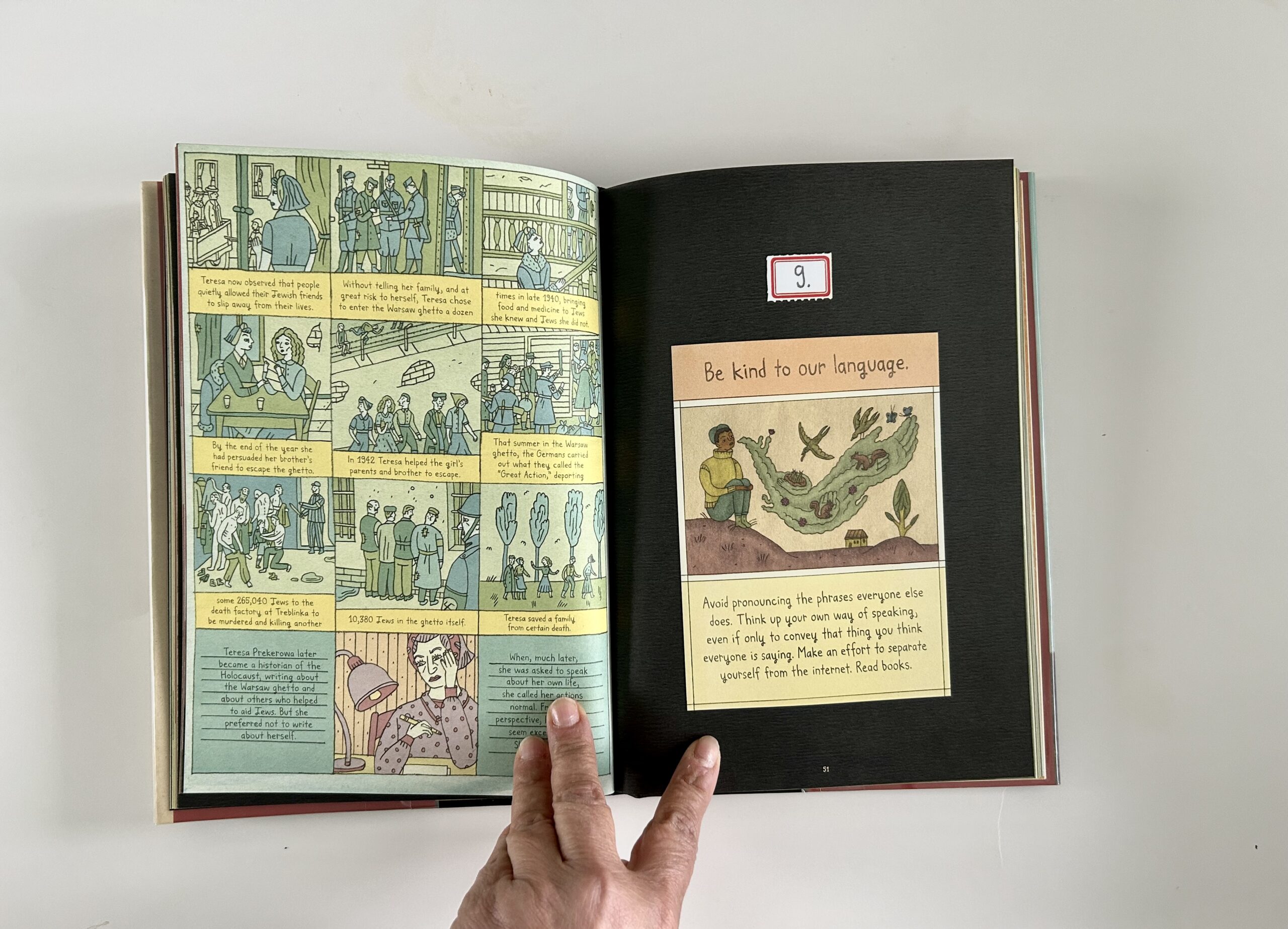
This one struck a deeply personal chord. Snyder warns that when we allow our language to be corrupted – by clichés, slogans, or euphemisms – we lose our ability to think clearly. And without clarity, resistance falters.
In design and in peace-building, language is everything. The words we choose, whether in a campaign, a caption, or a classroom, shape the emotional and moral tone of a message.
Being kind to language means slowing down. It means resisting the pressure to oversimplify or to mimic what ‘sounds right.’ It means choosing words that illuminate, not obscure – and in doing so, leaving space for complexity, dignity, and dialogue.
‘Be as courageous as you can.’
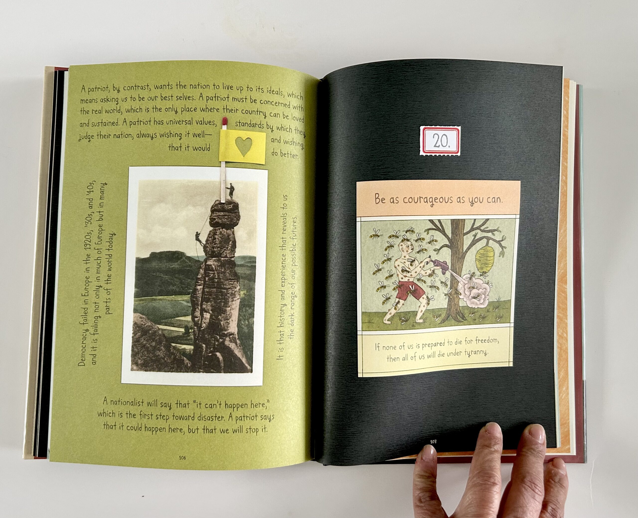
This final lesson feels like a quiet benediction. Not a call to be a hero, but an invitation to resist despair. To act with intention, even when the actions feel small.
In many ways, that’s how I see the role of socially engaged design. Courage might look like asking different questions in the classroom. Creating a poster that interrupts a false narrative. Or choosing to design systems that serve equity, rather than efficiency alone.
Courage, in design, is not always loud – but it is always deliberate.
Reading On Tyranny has reminded me that peace is not just the absence of conflict – it is the presence of ethics, imagination, and resistance. It is built, not wished for.
As a designer and educator, I find myself returning to the small, steady acts: asking better questions in the classroom, creating visuals that invite dialogue rather than dictate meaning, choosing words that clarify rather than cloud.
Snyder’s lessons aren’t just political – they’re profoundly human. They urge us to stay awake. To stay kind. To stay deliberate.
In the face of rising authoritarianism, we may not all be activists, but we can all be attentive. We can be responsible with our words, intentional with our images, and courageous in the way we imagine peace – not as a distant ideal, but as something we are actively designing, one decision at a time.
This book is definitely making the ’to read’ list for my course.